One thing I’ve had a lot of fun with is little hand-drawn diagrams to help me explain things. Some examples:
→ Sorbet’s
weird approach to exception handling
→ GC.compact in
Pictures
→ Compiling
Ruby to Native Code with Sorbet and LLVM
Here’s my workflow for drawing them:
I draw the diagrams with an Apple Pencil on a 12.9-inch iPad Pro (2nd generation) that I bought new in 2017—it still runs as well as the day I brought it home. It took a little time to get used to the feeling of drawing with plastic-on-glass instead of ink-on-paper, but I find that the super-low-latency of the screen helps a lot.
I simply use the default Notes app. I tried some other apps but found that I kept coming back to Notes at the end of the day (I also use Notes for random notes I need to jot down).
The text and lines are all free-form. I like the charm that it adds to posts—I don’t want something super polished looking like you’d get from another diagramming tool.
To export a finished diagram for use in a post, I lasso-select the piece I want to export, copy it, and then switch to the Dropbox app on my iPad.Previously, I would paste the image into an iMessage with myself, then hop over to a laptop to save it as a file.
Dropbox lets you save an image on the clipboard as a file, and from there I can rename and move it wherever I need to.

The images are transparent by default (which is nice) and the lasso-select crops the export to the same size every time a selection is made (important for the next step).
I really like that my blog has a high quality light and dark theme—try toggling on your device!—but all that work goes away if there’s a big white diagram on an otherwise dark-mode page.
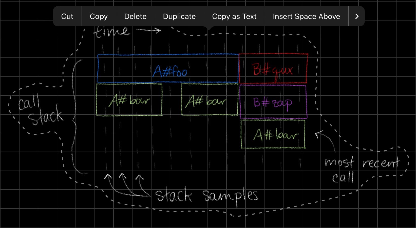
The fun thing about drawing in Notes is that I get light and dark versions of the diagrams for free. When I switch from light to dark mode on my iPad, the Notes app re-renders all my drawings to use dark-mode-friendly colors (for example, black lines become white lines).
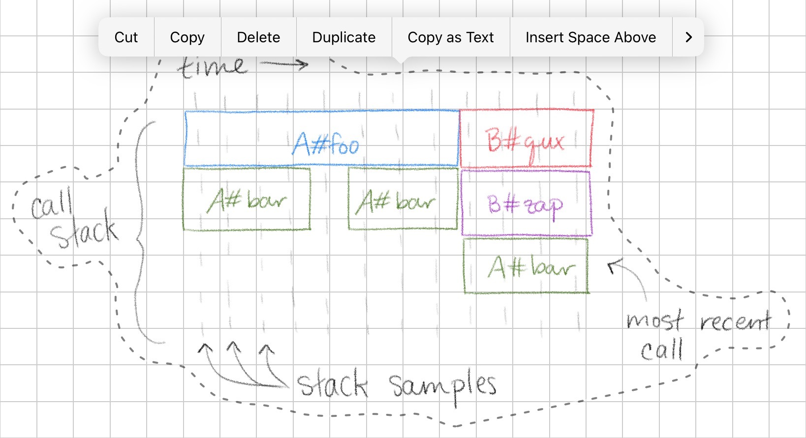
Here’s what it looks like in practice:
As long as the light and dark mode images have the same cropping (which they do, because of the the Notes lasso select) then the rendered page will look the same in light or dark.
Once I have light and dark versions of both images, I have some CSS on my blog that lets me just put the two directly adjacent in the source, and one of them will get
display: none. So this Markdown:Here's an example image:   As you can see, ...and this CSS combine to show the relevant image and hide the other.
I like that it’s very light on additional markup in the page.
That’s pretty much it 👌 It’s a bit clunky (it would be neat if I could streamline or even automate the export flow), but it’s not that bad. In any given post I’ll usually only have a two or three diagrams so it’s not super toilsome, and adds a nice bit of charm.